Sector 4 displays a graph of automatically detected R waves on the ECG, and when the corresponding cell in sector 1 is activated (see Fig. 2.2a) it also displays the ECG curve itself. We have already become familiar with this part (see the subsections: “Sector 1.1”, “Sector 1.2”, “Sector 1.4”). By and large, the function of this sector is described and understood. It remains, using the example of some ECGs in sector 4, to consider working with the functional icons that we briefly described in Chapter 1.
Let us note immediately that manual processing of the ECG—for example, calculating intervals or amplitude characteristics—is best carried out on the “Time domain” page.
Let us begin with the already familiar “+” icon – “Zoom In” (Fig. 1.8f). If, after activating this icon (the active icon is colored blue), you move the cursor over the image in sector 4 and press the right mouse button, a window with a list of further actions will appear (Fig. 2.11a). By default (the selected line is additionally highlighted when the cursor is placed on it), the function is active that allows you to enlarge the image both horizontally (we considered horizontal enlargement when describing the subsection “Sector 1.4”) and vertically. The choice of direction is up to you. If, by pressing and holding the left mouse button, you select a horizontal segment, the ECG will be stretched horizontally, i.e., along the time scale (Fig. 2.11c, d); if you select a segment of the ECG vertically, the ECG will be enlarged on the screen by amplitude within the selected range in the sector window (Fig. 2.11e, f).
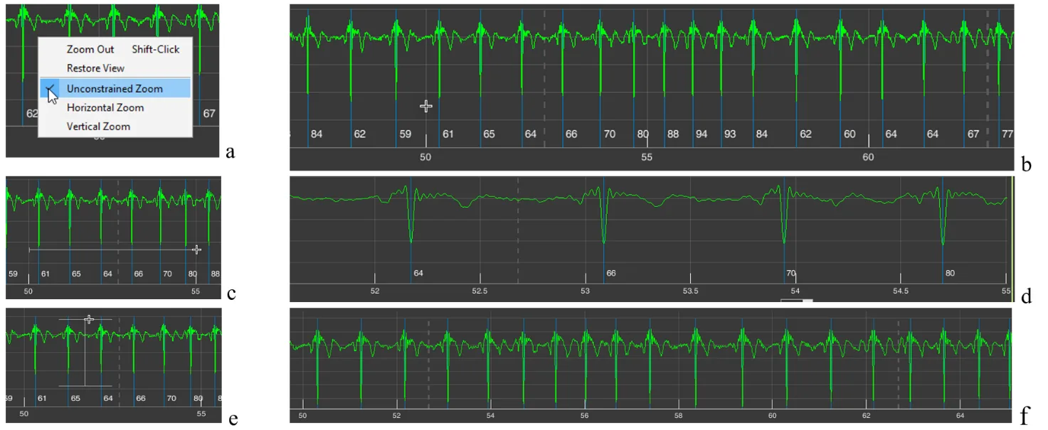
Figure 2.11. Possibilities for changing image scaling in sector 4 when the “+” icon is activated by default or when the “Unconstrained Zoom” line is activated (explanations in the text)
All these actions can be performed immediately after activating the “+” icon, without calling the window described above. We repeat: the “Unconstrained Zoom” line is active by default.
Sometimes such a function is inconvenient for someone. Then, by activating the “Horizontal Zoom” (Fig. 2.12a) and/or “Vertical Zoom” (Fig. 2.12c) lines, you can choose the required direction for scaling; in this case, the cursor will not be in the form of a cross (Fig. 2.11b) but with arrows indicating the selected direction (Fig. 2.11b and d).
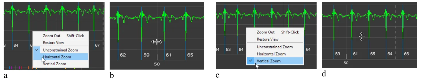
Figure 2.12. Possibilities for changing image scaling in sector 4 when the “Horizontal Zoom” and “Vertical Zoom” lines are activated (explanations in the text)
The “Zoom Out” line is activated when you click on it (Fig. 2.13c). In this case, the scaling process you performed earlier is cancelled step by step (Fig. 2.13a – stretching the time scale; see Fig. 2.13 from b to d) (Fig. 2.13e, f).
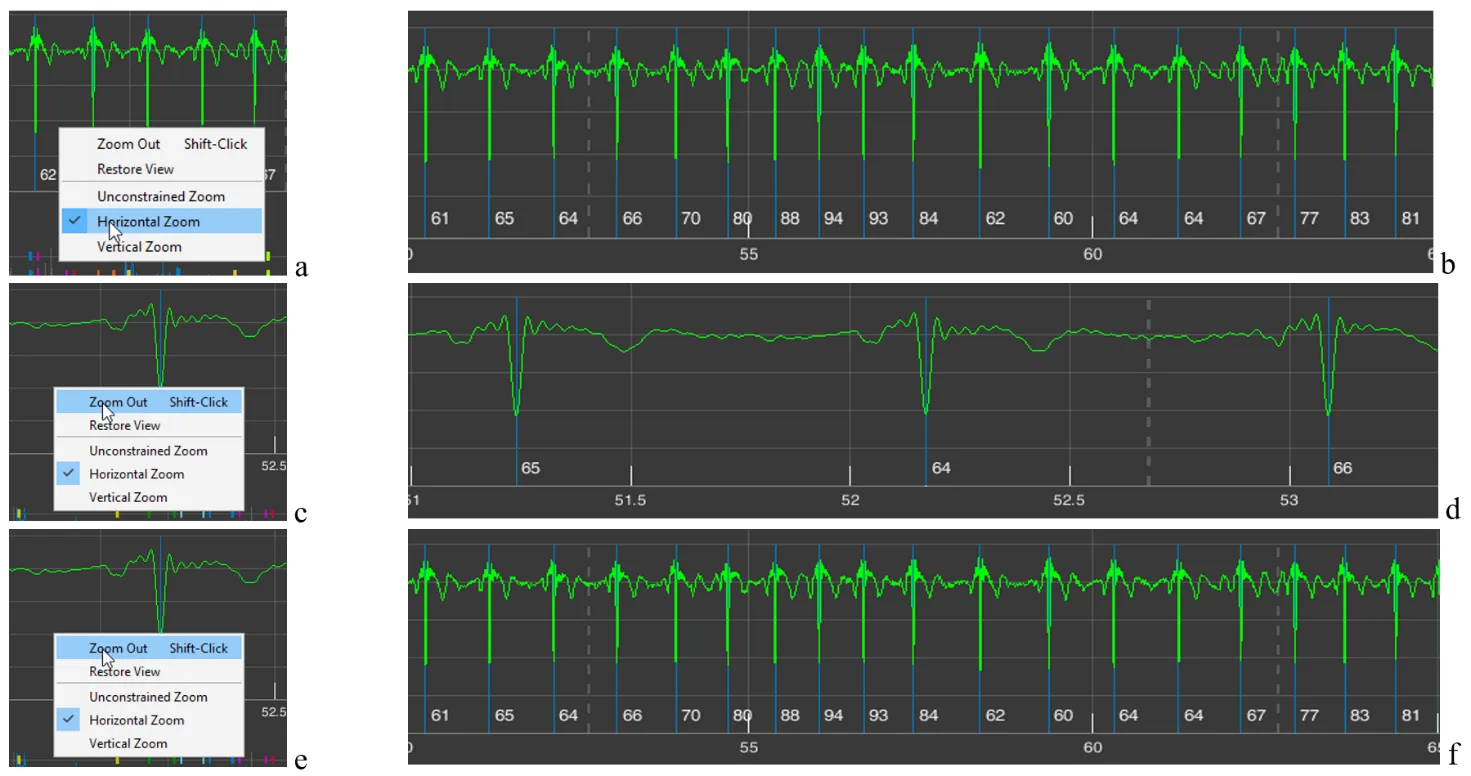
Figure 2.13. Changes in image scaling in sector 4 when the “Zoom Out” line is activated (explanations in the text)
The need to repeatedly activate the “Zoom Out” line is not always convenient. Therefore, you can click (activate) the “Restore View” line (Fig. 2.14a) and return to the image in sector 4 that appears upon loading (Fig. 2.14b), and then, by activating the “+” icon, return to the required time point and the desired zoom level.
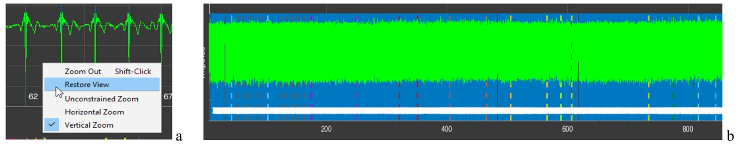
Figure 2.14. Changes in the image zoom in sector 4 when the “Restore View” line is activated (see explanation in the text)
The same result, of returning back to a more compressed time scale or ECG-signal amplitude, can be achieved if you activate the “-” icon – “Zoom Out” (Fig. 1.8g). In this case, the additional window that appears (Fig. 2.11a) will be the same. But the cursors will have the “-” sign (Fig. 2.15). A click with the cursor without arrows (Fig. 2.15a) will reduce both the vertical and horizontal scale step by step; with horizontal arrows (Fig. 2.15b) – the time scale; with vertical arrows (Fig. 2.15c) – the amplitude scale.
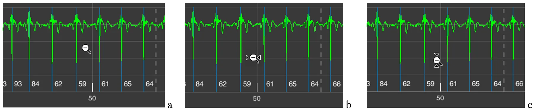
Figure 2.15. Cursors with the “-” icon active: a – when the “Unconstrained Zoom” line is activated; b – the “Horizontal Zoom” line; c – the “Vertical Zoom” line
The same result as with the “Restore View” line can be obtained by activating the icon with a house, which is also called “Restore View” (Fig. 1.8g). Therefore, in the future we will not return to this icon.
As we can see, the same result can be achieved in different ways. Which is better? This is at the discretion of the researcher: to choose the way of working with the CleverView page that is convenient or familiar to them.
Icon with the image of a paint brush – “Brush/Select Data” (Fig. 1.8c). Activate it and, while holding down the left mouse button, select the area that you want to highlight in a different color (Fig. 2.16a), and release the mouse button. The result is shown in Fig. 2.16b. To remove the color highlighting, it is enough to click once while keeping the cursor in the area of the background (black) field.
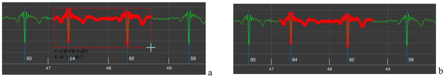
Figure 2.16. Result of actions when the “Brush/Select Data” icon is active (explanations in the text)
This procedure is useful if you are working on any publication, regardless of the platform. You may see other possibilities for such a function. We wish you creative success and reflection!
Icon depicting lines in a window – “Data Tips” (Fig. 1.8d). We remind you that with its help you can determine the coordinates of a point on the curve that interests us. To do this, activate the icon, move the cursor to the required place on the curve, click the left mouse button, and obtain a coordinate window (Fig. 2.17a). If necessary, the position can be adjusted with the “<” and “>” arrows on the keyboard. The “X” axis shows time, the “Y” axis shows signal amplitude (for the ECG on our scale, in V (volts)). By holding down the “Alt” key, you can place data for a larger number of points on the curve (Fig. 1.17b).
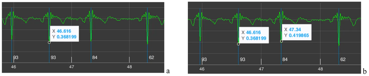
Figure 2.17. Result of actions when the “Data Tips” icon is active (explanations in the text)
In our example, we marked on the ECG two consecutive R waves. Let us recall that next to the blue line marking the R wave, the value of the instantaneous HR is indicated below – 84 for the second “our” R wave. Let us check. The time of appearance of our first R wave is 46,616 seconds, of the second – 47,340 seconds. We calculate the duration of the RR interval: 47,340 s – 46,616 s = 0,718 s. Now let us calculate what the HR would be with such an interval between successive heart contractions: HR = 60/0,718 = 83,6 beats/min, or ≈ 84 beats/min. We conclude that the automatic calculation is correct.
The example with the calculation of instantaneous heart rate is provided not so much to confirm the correctness of CleverView’s operation, as to demonstrate its capabilities when working with digital data in scientific work.
The next functional icon is “Pan” (Fig. 1.8e). Activating the hand-shaped icon causes a similar cursor to appear on the screen. Working with it is very simple: place the cursor on our ECG curve, hold down the left mouse button, and slightly move the mouse in different directions. Everything is very clear and, we hope, does not require special explanations of what this function is needed for.
In what follows, functional icons will be referred to by their names.
And we need to move on.